Ticketfill is a movie ticket-ordering app for people that appreciate a simple way to order multiple tickets for movies for friends and family.

Ticketfill is a movie ticket-ordering app for people that would like a simple way to order multiple movie tickets for friends and family. I decided to focus on the core experience of ordering tickets in a 3 part process that was easy to understand and quick to do. The app tries to solve issues that users have while ordering tickets. From not being able to reserve multiple seats on the app to ordering tickets without putting all your personal information.
Personal project
User research, Visual design.
I sent out surveys to understand what were the common issues people were having while trying to buy tickets. A primary target audience I identified was young adults who regularly go to the movie theater and bought tickets for friends also. The users confirmed some assumptions I had about the experience being very confusing and just tedious at times, but with this research, I discovered a couple of main issues other people are having. Some user problems include Privacy concerns, Not being able to compare prices for each theater, and Interface taking too long.


With the research underway, I went and aligned some of the core issues we are tackling with personas that fit the demographic quite well. Antonio had goals to order multiple tickets and also pick the seats for family and friends. While Jim wanted more security and less personal information needed.

Our key competitors are Fandango and Atom. Fandango is the most well-known ticket ordering app with the largest selection of theaters and a big budget for advertisements behind them. Atom has more options for advanced users. Our other competitors are AMC theaters and Cinemark Theaters. These are indirect as they only allow people to order from their theaters which are not available globally.
Fandango is the largest with many bad reviews and a lot of bad user experience to go with it. The app is filled with ads. The design overall feels very basic with the navigation being hard to understand.
Atom is more visually appealing while being easy to use. Although the app has minor problems with the experience overall, the app feels complete and intuitive.
AMC theaters have the best quality product out of the punch. The design is clean and simple. The only problem with the app is that it’s slower than the rest.
Cinemark theaters is an overall good experience. The features are lacking and the design is simple, but it does all the important things to a simple degree.

After sketching out some pen-on-paper wireframes and thinking through the main flow, I reviewed what was necessary, and unnecessary, and what areas needed improvement. I poured a lot of time into this step to make sure I had the finishing touches on the underlying UX before moving on to the visuals.
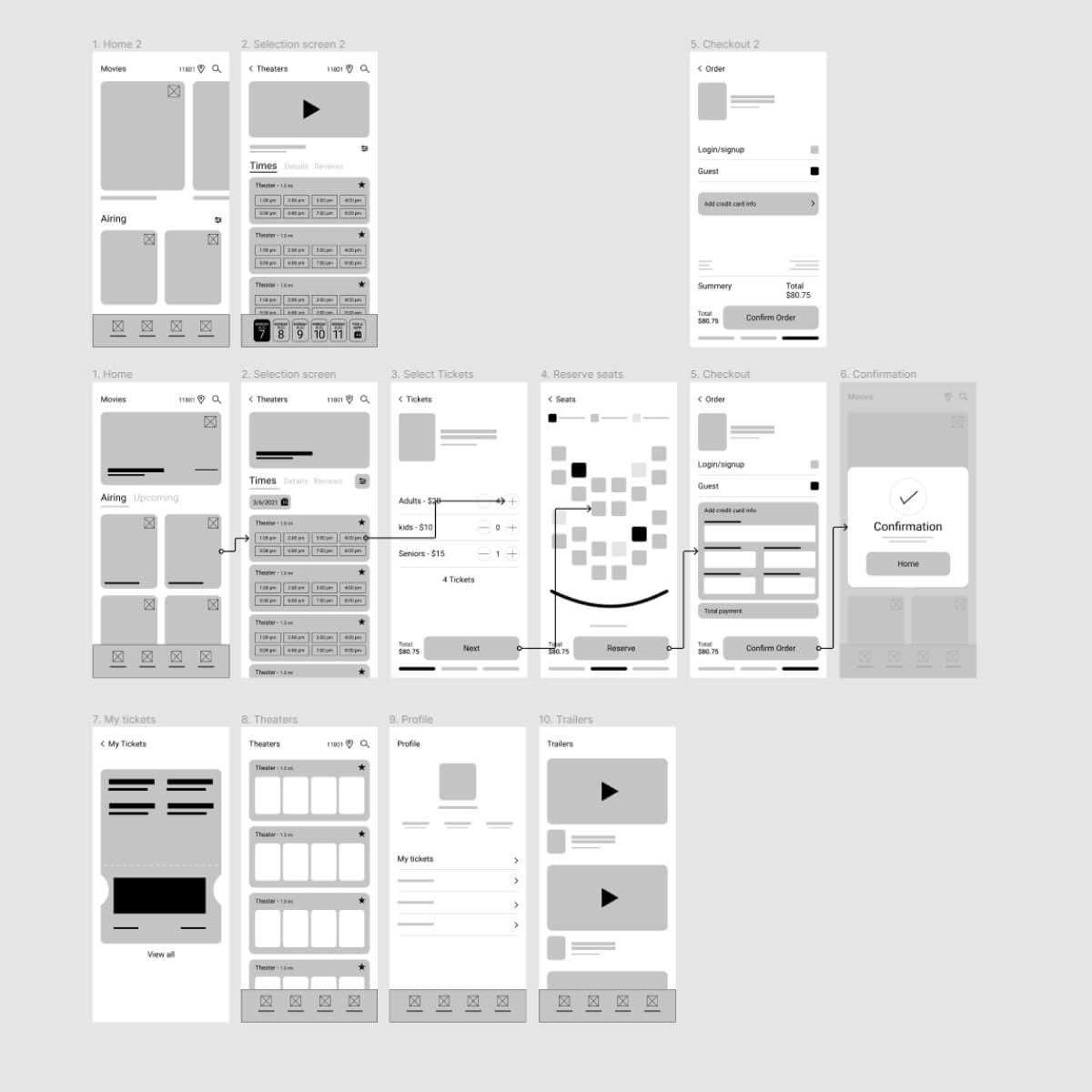

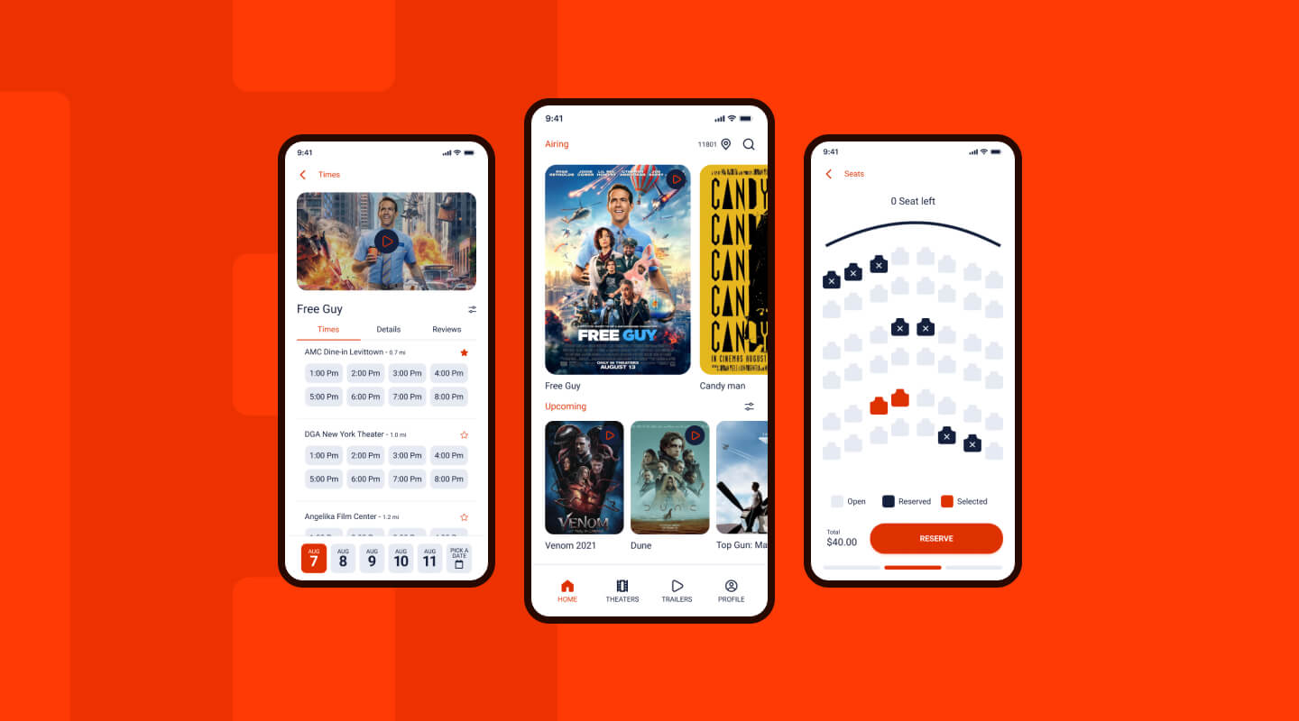
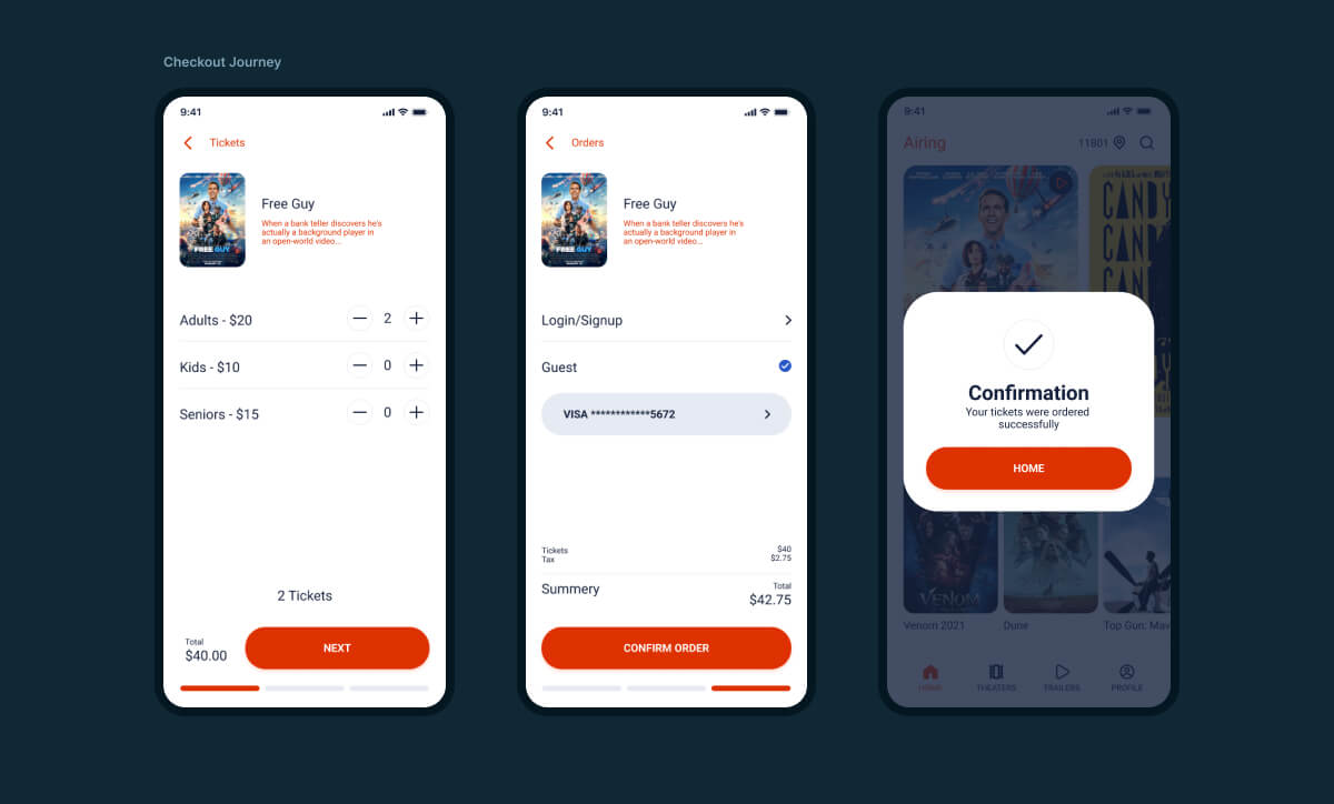
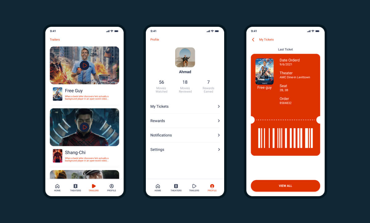
While designing the app I put a lot of thought into not only the experience but seeing every page the user will go through in the process. I approached this project differently from how I usually do. I focused on just making the experience as short as possible but I didn't want to sacrifice usability with the designs. It's something I will put more thought into in the future!
